Consolidating 3 premium confectionery brands in one shoot
SSC Brands was established in 2021 with a clear vision: to ensure every batch produced delivers a delicious moment in time.
(Something we can definitely get behind here at Powerhouse!)
In just a few short years, SSC has built a portfolio of premium craft confectionery brands, Mallow & Marsh, Mighty Fine, Lexi’s Treats, Mr Stanley’s, and Ultimate English, designed to delight consumers who expect nothing but the very best. Each brand is driven by a shared commitment to quality, authenticity, and bold, memorable flavour.
About this post
Published
Services
April 24, 2025
Production
Production Strategy
The brief
SSC Brands partnered with us for a multi-brand shoot to enhance the visual identity of three of their premium confectionery brands: Mallow & Marsh, Mighty Fine and Mr Stanley’s. The assets needed to span lifestyle and functional formats, and work hard across digital, print, CRM, and seasonal campaigns.
This is where we thrive! With brands of this scale and such diverse needs, the production aimed to establish a cohesive yet unique visual identity for each brand, all while optimising efficiency through smart planning.
The challenges
This was a fast-paced shoot packed with creative ambition and some seriously complex product handling. Here’s what we were up against:
Distinct, but cohesive: Each SSC brand has its own personality. We needed to reflect that in the visuals, while still tying everything together under one portfolio. That meant creative tweaks to styling and tone, enough to make each brand sing, but not shout over the others.
Chocolate care: Chocolate’s a tough customer; every mark, scratch or smudge shows up under the lights. We had to tread carefully, using heat just enough to smooth things out without changing the product’s natural look.
Texture matters: With the mallow-based treats, the texture was the star. We leaned into that soft, cloud-like appearance, capturing their charm in a way that made them look every bit as tasty as they are.
Pre-launch packaging: Some products hadn’t hit shelves yet and came with two types of packaging, each printed differently. Our challenge? Keep the visuals consistent and polished, while staying true to the look of the final packs. This called for some expert-level retouching to get just the right balance.
Volume & versatility: With a high number of shots to deliver (especially for product-heavy brands like Mr Stanley’s) we had to be smart with setups.
And the kicker? Everything had to move fast. No time for reshoots. Every setup had to earn its place and deliver maximum value.
Our approach
To meet tight deadlines and deliver at scale, we ran a strategically designed, multi-brand shoot from our Studio 01 over seven days.
We planned and shot simultaneously across rigs, reusing and mixing props, surfaces, backgrounds and lighting setups to keep things running like clockwork. With volume and versatility top of mind, we brought together a nimble, self-sufficient crew – including a Producer, Creative, and Food Stylist – to work fluidly across three distinct brand worlds. Every shot was crafted to reflect the unique tone of each brand, while staying mindful of consistency where crossovers made sense.
Let’s break them down, one by one:
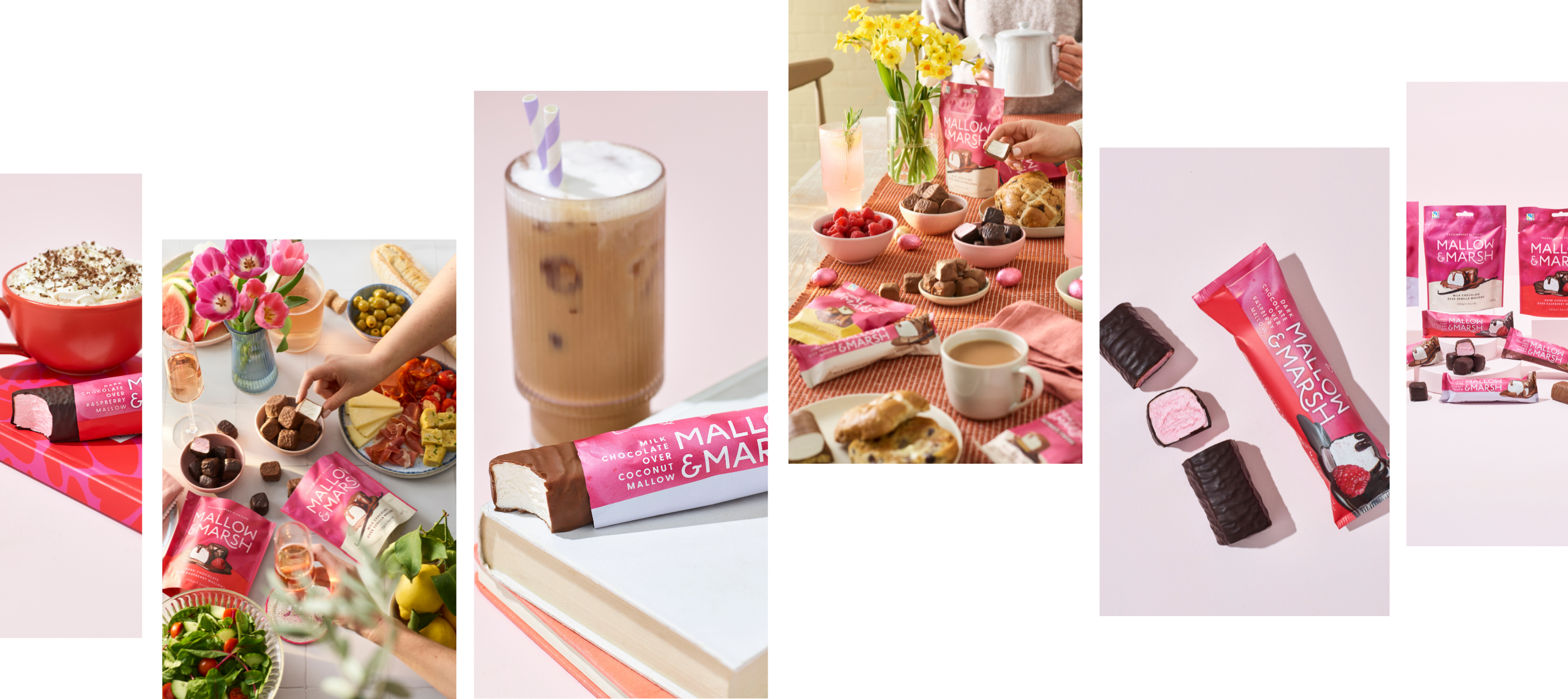
Mallow & Marsh
For Mallow & Marsh, the vision centred around calm, café-style lifestyle moments that feel inviting and creative. The setup was intentionally distinct from the brand’s s’mores identity, focusing instead on simple, styled scenes using plinths and curated props. Natural light played a key role in creating soft, relaxed environments. Content included both wide banner shots and tight portrait crops, with hands-in and hands-out shots used to add warmth and human presence. Seasonal cues were subtly introduced, such as hot cross buns and Spring flowers for Easter, and cosy styling for Autumn and Christmas. The goal was to craft an approachable, premium feel that felt modern, relaxed, and quietly indulgent.
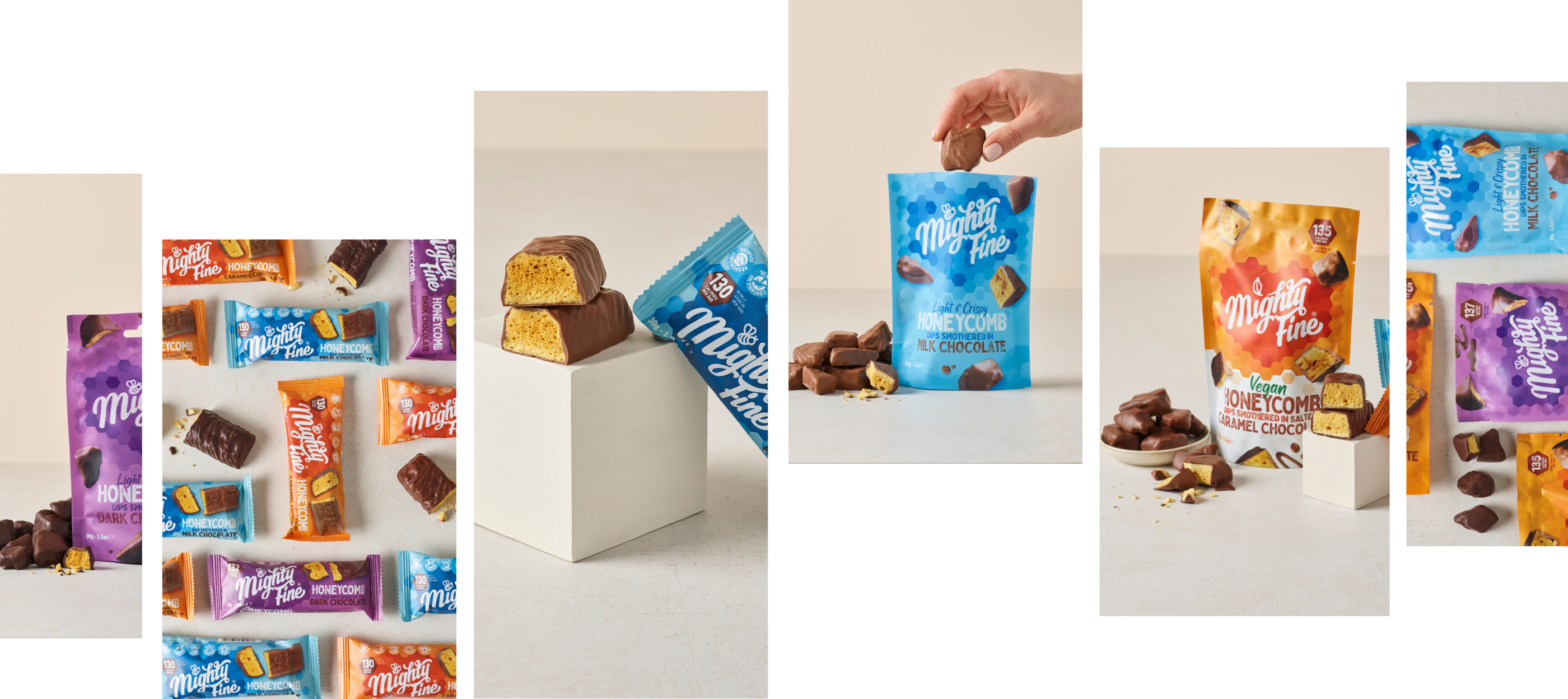
Mighty Fine
The focus for Mighty Fine was on clean, functional product shots of pouch and bar packs, with no lifestyle context required. The creative direction leaned into muted tones with subtle pops of colour, inspired by existing brand guidelines. Products were styled using plinths to create a premium, structured feel. The chosen colour palette was designed to carry across into Mr Stanley’s content, offering consistency between brand worlds where appropriate. Assets were optimised for e-commerce use, including Amazon banner formats.
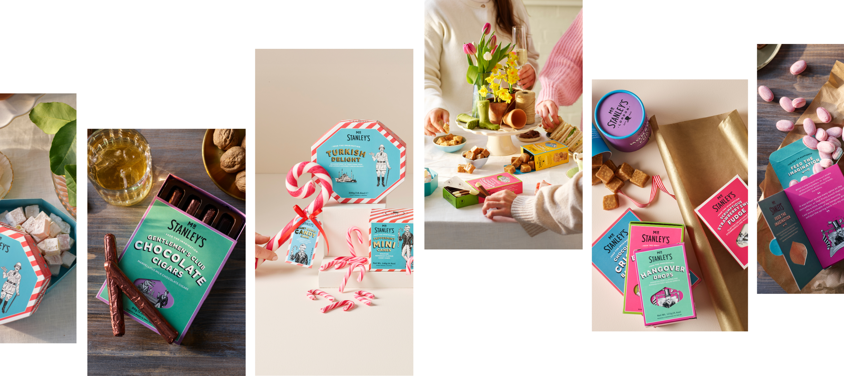
Mr Stanley’s
Mr Stanley’s content required a rich, nostalgic lifestyle look with a traditional feel. Props such as wicker baskets, copper pots, and hampers helped evoke a warm, olde-world charm. Scenes included hands in shot and people toasting in the background to build a sense of occasion and conviviality. Styling focused on woollens, plain fabrics, and neutral tones, with wardrobe shifts to reflect different seasons; Summer, Easter, Halloween, and Christmas. Importantly, the shoot avoided single-product imagery, instead showcasing collections and curated setups. A separate setup captured the brand’s novelty chocolate range (featuring items like chocolate fish and sports-themed moulds), and stop-motion techniques were explored to add a playful, engaging layer to the final content.
A lot of the heavy lifting happened on set, thanks to our brilliant creative Victoria Harley and in-house food stylist, James Sargent, who worked in tandem to ensure all rigs were ready for the shoot. We used gentle heat to smooth out surface scratches and scuffs on the chocolate, making post-production a lot easier. The mallows, with their soft, pillowy texture, received the same level of care; we wanted them to look as good as they taste, without losing that real, squishy charm.
Once the shoot wrapped, every image went through a considered round of retouching. The final step that really pulls everything together. We’re not into over-polishing or making things look fake. We’re all about enhancing what’s already there: cleaning up small imperfections, refining packaging tones, and making sure everything feels sharp, premium, and true to life.
This kind of finesse is second nature to us at Powerhouse. We do things properly, no shortcuts. Always hitting that sweet spot between polish and authenticity.
Results
A vast, versatile bank of imagery that SSC can confidently draw on all year round, from seasonal campaigns and key occasions to everyday content needs. Whether it’s digital comms, social posts, sales materials, or trade shows, they’re now fully equipped to show up consistently and with impact, whenever and wherever it matters.
145
stills
13
short stop motion videos
7
shooting days
Who worked on this one
This project wouldn't have been possible without our awesome team!