Balancing tradition and modernity in Bettys’ refreshed visual identity
Bettys is a historic and beloved British brand, founded in 1919 by Swiss confectioner Frederick Belmont. Known for its elegant tea rooms, handcrafted cakes, and fine foods, Bettys has become an iconic name in the food and beverage industry. With a rich heritage rooted in Swiss precision and British tradition, the brand is celebrated for its commitment to quality, craftsmanship, and timeless elegance. Today, Bettys continues to attract people from around the world, offering indulgent treats and exquisite dining experiences that delight generations of loyal customers and international visitors alike.
About this post
Published
Services
May 29, 2025
Production Strategy
Production
Creative
The brief
Bettys approached us with a request that was as much about evolution as it was about preservation: refining their visual identity to resonate with a younger, digitally savvy audience, while maintaining their established heritage. The focus was primarily on online web use, with the intention of it influencing all other channels and mediums.
With a rich heritage dating back to 1919, the brand embodies a blend of tradition, elegance, and quality. Having worked with Bettys for over 20 years, we were uniquely positioned to take on this project. Our longstanding partnership had given us more than just a working knowledge of the brand; we understood the essence of the brand. From the careful curation of their famous afternoon teas to their timeless packaging design, we had gained deep insight into the meticulous craft and high standards that define them.
The challenges
The challenge ahead was to evolve Bettys’ visual identity in a way that honoured their legacy while adding a contemporary touch. It was a delicate balance, maintaining a look and feel that their loyal customer base could still recognise and cherish, while introducing a fresh perspective that would make the brand stand out in an increasingly competitive market.
However, the project’s scale and scope proved to be the biggest challenge of all. The work involved more than just a few adjustments – it required a complete overhaul of the brand’s visual language, from the colour palette to the overall composition and the very look and feel. Each product and range needed to be considered individually but also fit seamlessly into the broader vision for the brand, ensuring consistency throughout.
Our approach
Our approach was divided into five key stages: Discovery, Research, Strategy, Planning, and Delivery. We achieved this through:
- Brand workshops: In-depth workshops with key stakeholders to gather insights on the brand’s core values, customer perceptions, and market positioning. This ensured that our work aligned with their vision.
- Competitor analysis: An analysis of competitors revealed opportunities for differentiation. We identified visual elements that resonated with consumers and those that fell flat, guiding our visual choices.
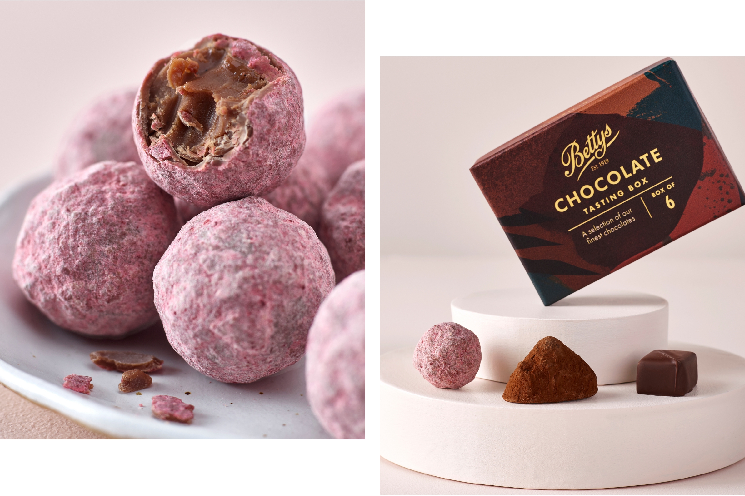
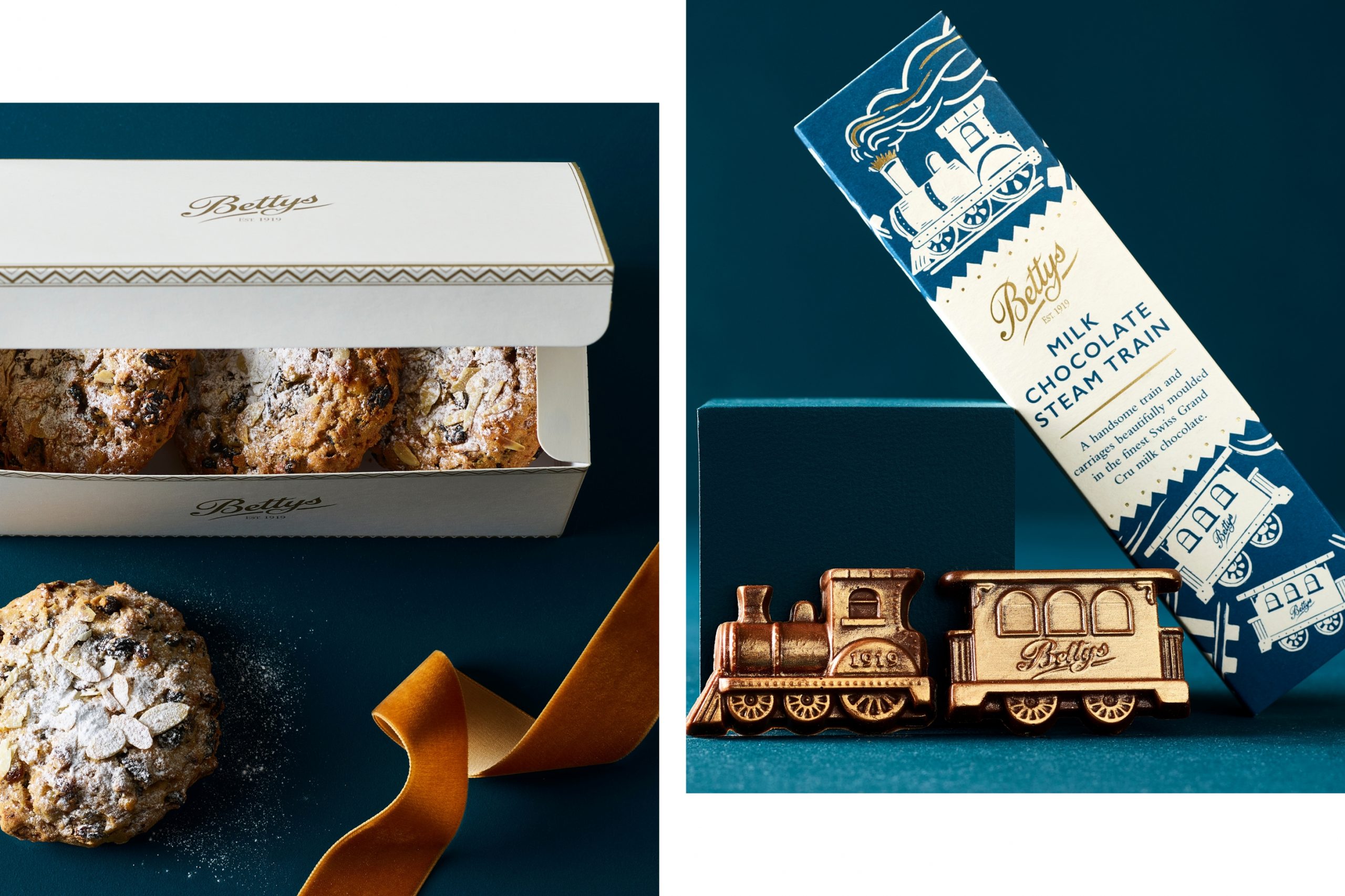
- Full art direction: From moodboards and scamps, to set design, styling, lighting and retouching direction, we managed every aspect of the visual process. This ensured each product worked cohesively within its category and across the entire brand ecosystem. We prioritised versatility, creating multifunctional assets with long-term relevance, while developing specific colour guidelines for both seasonal and all-year-round use.
- Feedback loops: We presented the concepts to Bettys’ team for regular feedback and refinement, ensuring they felt authentic and aligned with their brand. This process included weekly review sessions, test shoots, and detailed report tracking to monitor progress and incorporate insights for continuous improvement.
- Final delivery: We provided a comprehensive asset library containing all the final visuals, optimised in the necessary sizes and formats, ready for deployment across digital and print.
In short: every range, every page, every product was refreshed with tailored variations designed to suit format, function, and audience.
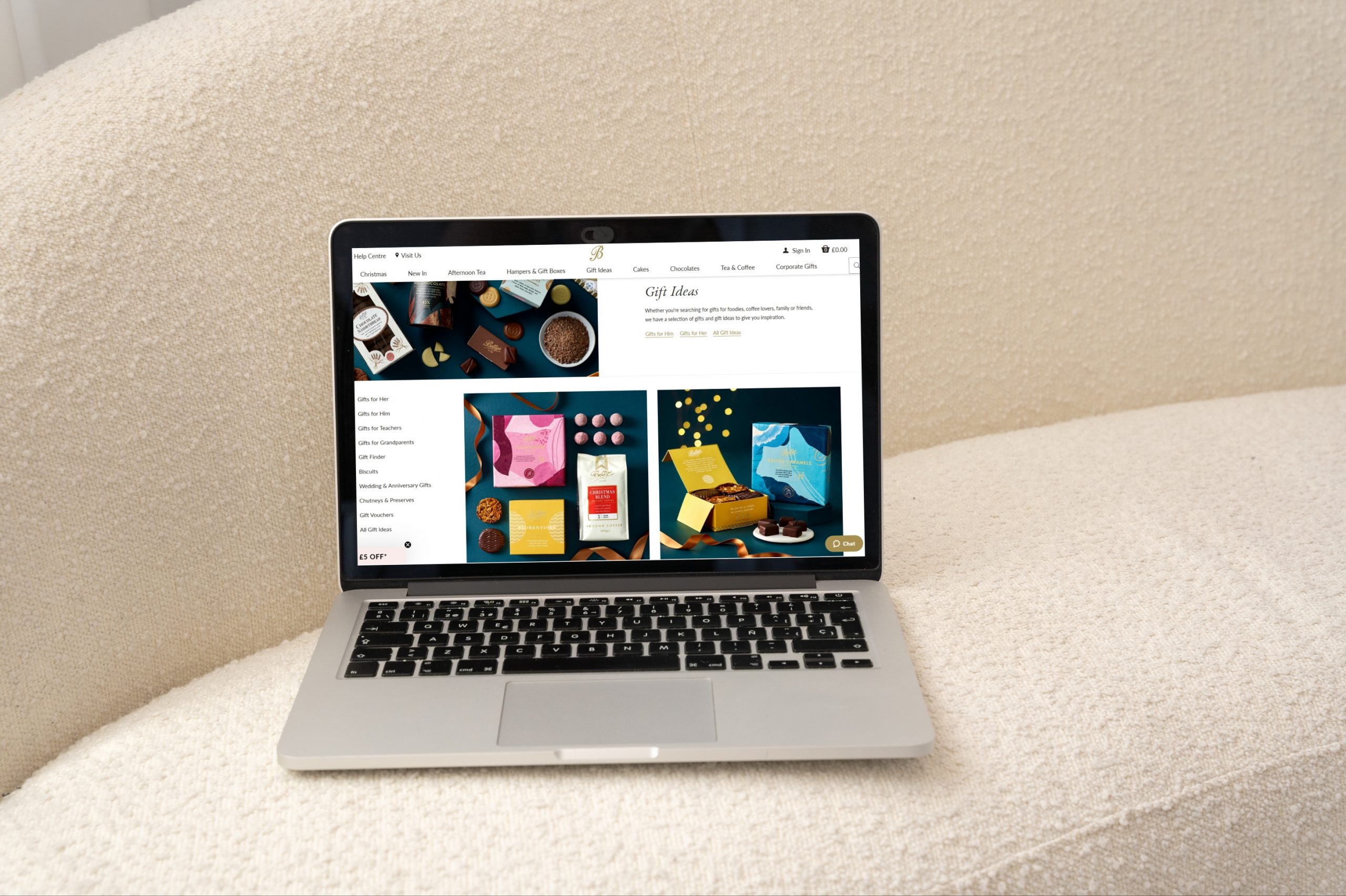
This was a massive production resulting in a complete website overhaul for Bettys. From homepage heroes to product close-ups, each visual was purpose-built to enhance storytelling and drive conversion. Clearer navigation, elevated presentation, and a visual identity that stands out in a crowded market.
Take a peek below or get the full scoop at bettys.com.
The results
In just 85 days — from pre to post — we delivered over 900 assets and a full set of photography guidelines to help overhaul their entire website.
But more importantly, we set them up for the future. Every product and scenario now follows clear visual rules, from colour palettes to composition. As the range grows, each new product can slot seamlessly into the system.
900+
assets
65
shooting days
Who worked on this one
This project wouldn't have been possible without our awesome team!